"The Group," a prominent entity in the Qatar Stock Exchange, engaged our leading UX consulting firm to conduct a comprehensive UX Audit of their Forex mobile application.
A UX Audit, like a health check, is a comprehensive assessment that involves evaluating and appraising a website, web application, or mobile app. The ultimate goal is to identify core usability issues and come up with handy and actionable recommendations to improve solution usability and maximize ROI.
The audit revealed issues such as information overload, complex navigation, outdated UI design, and inconsistencies. The imperative to address these concerns and set a new standard for user experience prompted ‘The Group’ to initiate this transformative journey.
Impact
Through the comprehensive UX Audit, we were able to identify critical usability issues within ‘The Group’s’ Forex mobile app and provided recommendations with the potential to enhance the app’s perception, increase user satisfaction, and maximize ROI.
50%
Increase in user engagement following a UX audit
40%
Boost in customer retention due to enhanced customer experience
100%
Potential increase of ROI following a UX Audit
Increase in market advantage due to better customer satisfaction
Objectives
Together with the client, we set five main objectives to achieve on the level of the app at the end of the process:
Pinpoint usability issues and provide insightful recommendations that will guarantee customer satisfaction.
Improve the user journey within the app by implementing a user-centered design strategy to achieve a seamless and up-to-date experience.
Increase user satisfaction rate
Reduce development time and cost
Challenges
Along our path toward our goals, we faced various challenges, including:
Simplifying data-intensive transaction screens that can lead to user confusion, frustration, and slower decision-making
Maintaining ease of use for all levels of Forex users while dealing with the complexity of this mobile app
Taking into account Qatar’s mental model, cultural alignment, and localized best practices.
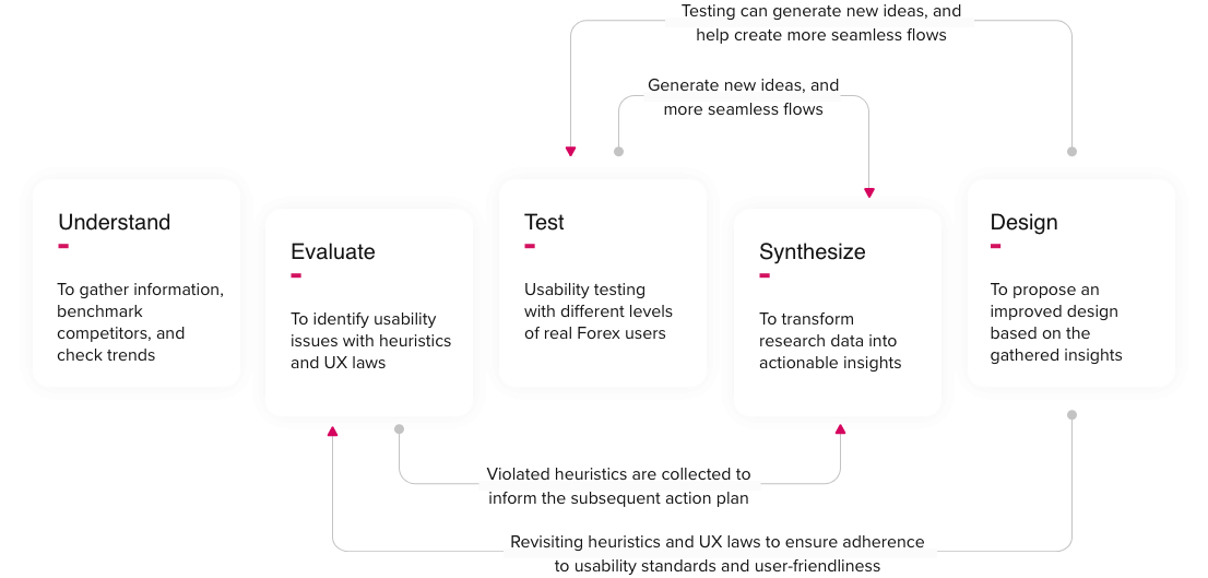
Methodology
Starting with UX research as our foundation, we acquired essential data for the thorough examination of pain points and user needs. We customized the following iterative process to create an alternative design based on our findings:
Understand
Evaluate
Test
Synthesize
Design
Understand the Business
Our approach was crucial in stepping into the complex world of forex, particularly with an advanced app catering to users with varying levels of experience. To tackle the intricacies and ensure the app was user-friendly for everyone, we started with collaborative activities and a workshop involving key stakeholders. This helped us work together, align goals, and clearly define our goals.
At the same time, we dove deep into the forex industry. We had conversations with stakeholders, conducted one-on-one interviews with people from different expertise levels in forex, and delved into desk research to understand the industry thoroughly. This mix of activities not only improved communication and reduced misunderstandings but also created a strong sense of unity among our team. It allowed us to bridge the gap between the complexity of the Forex app and the diverse needs of its users.
Evaluate the Existing App
Our team conducted a comprehensive heuristic evaluation, also referred to as an expert review, and UX laws assessment, leveraging the combined expertise of five evaluators from our team and following the NN group heuristic criteria of evaluation. These evaluations were carried out by experts with varying levels of forex usage proficiency and seniority in the field of UX. The goal of this rigorous evaluation was to meticulously identify, categorize, and prioritize core usability issues within the app, adhering to scientific heuristics and considering diverse perspectives. This process was essential to ensure that we could comprehensively address and rectify these issues, thus enhancing the overall user experience.
Some findings from the conducted evaluations:
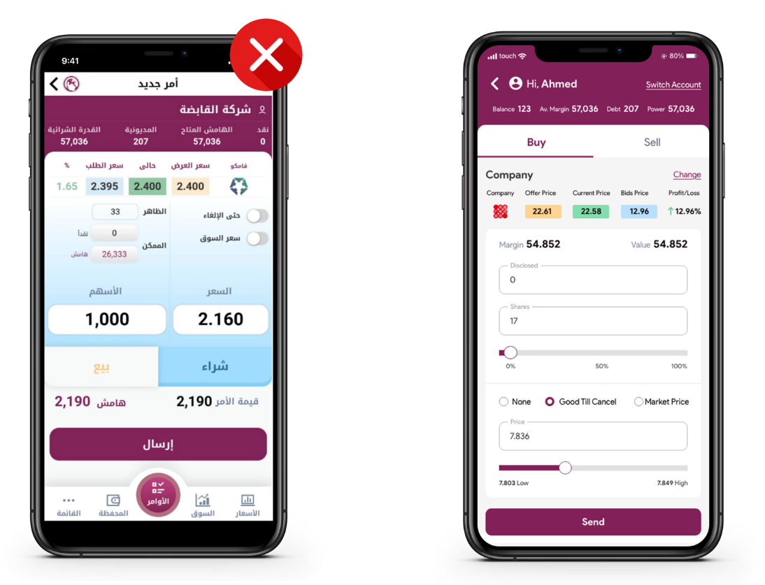
New order screen
Issues
No visual hierarchy that creates a flow to the screen, so the eye of the user can follow that flow towards the most important parts of the screen. Many identical components, and no visible priority.
Heuristics Violated
H2: Match between system and real-world / Severity: 4 The information is not presented naturally and logically in simple terms the user can understand.
H8: Aesthetic and minimalist design / Severity: 4 Irrelevant information reduces visibility, and more info on the screen increases users' cognitive load.
UX laws Violated
Law of Continuation: The human eye follows the paths, lines, and curves of a design, and prefers to see a continuous flow of visual elements rather than separated objects.
Law of proximity: The human eye perceives connections between visual elements. Elements that are close to each other are perceived to be related when compared with elements that are separate from each other.
New order screen
Issues
Lot of buttons or Calls to action in the framed area, without priority, or one outstanding button to easily attract users’ attention.
Heuristics Violated
H2: Match between system and real-world / Severity: 4 The information is not presented naturally and logically in simple terms the user can understand.
H8: Aesthetic and minimalist design / Severity: 4 Irrelevant information reduces visibility, and more info on the screen increases users' cognitive load.
UX laws Violated
Von Restroff Effect: Make important information or key actions visually distinctive. The Isolation Effect, predicts that when multiple similar objects are present, the one that differs from the rest is most likely to be remembered.
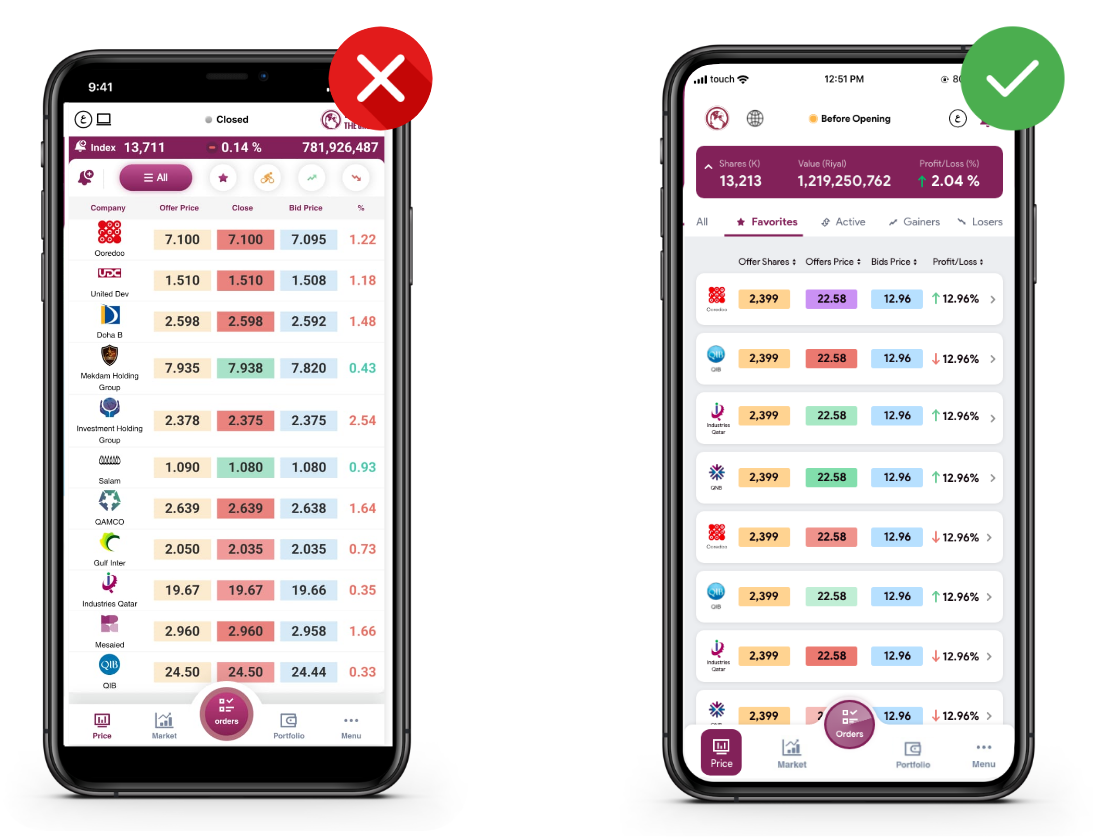
Market page
Issues
The interface is crowded and contains a lot of colors making it hard for users to scan it directly.
Heuristics Violated
H2: Match between system and real-world / Severity: 4 The information is not presented naturally and logically in simple terms the user can understand.
H8: Aesthetic and minimalist design / Severity: 4 Irrelevant information reduces visibility, and more info on the screen increases users' cognitive load.
UX laws Violated
Aesthetic-Usability Effect: Users often perceive aesthetically pleasing design as a more usable design.
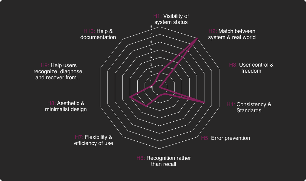
Heuristic Evaluation Summary
Following the heuristic evaluation of the existing app, this chart provides a comprehensive summary of the heuristics found to be violated during the assessment, aiming to uncover usability issues and identify areas for improvement. This chart serves as a valuable reference to highlight areas where the app can be enhanced to provide a more user-friendly and efficient experience.
Heuristic Evaluation Result
Test with representative users
User testing was a crucial step in our UX Audit process for ‘The Group’s’ Forex mobile application. Real Forex users with varying expertise levels engaged in simulated transactions, allowing us to evaluate usability and effectiveness. We observed user interactions closely, noting any confusion or frustration.
Insights gleaned from the user testing sessions played a pivotal role in refining the app’s design and functionality. We identified pain points, areas of confusion, and opportunities for improvement based on direct user feedback and observed behavior. These findings served as valuable inputs for iteratively refining the app’s interface and user experience, ultimately aligning it more closely with the needs and expectations of ‘The Group’s’ diverse user base
Synthesize
We pinpointed critical usability issues in ‘The Group’s’ Forex mobile app. Extensive usability testing sessions with diverse Forex users provided valuable qualitative feedback, refining our design proposals. Synthesizing qualitative and quantitative data, we prioritized design changes to enhance the overall user experience, aligning with Qatar’s cultural nuances. Through iterative prototyping and feedback, we ensured a seamless and intuitive user experience. Our synthesis culminated in a comprehensive design proposal, setting a new standard for user experience excellence. We’re committed to effective implementation in collaboration with ‘The Group.’
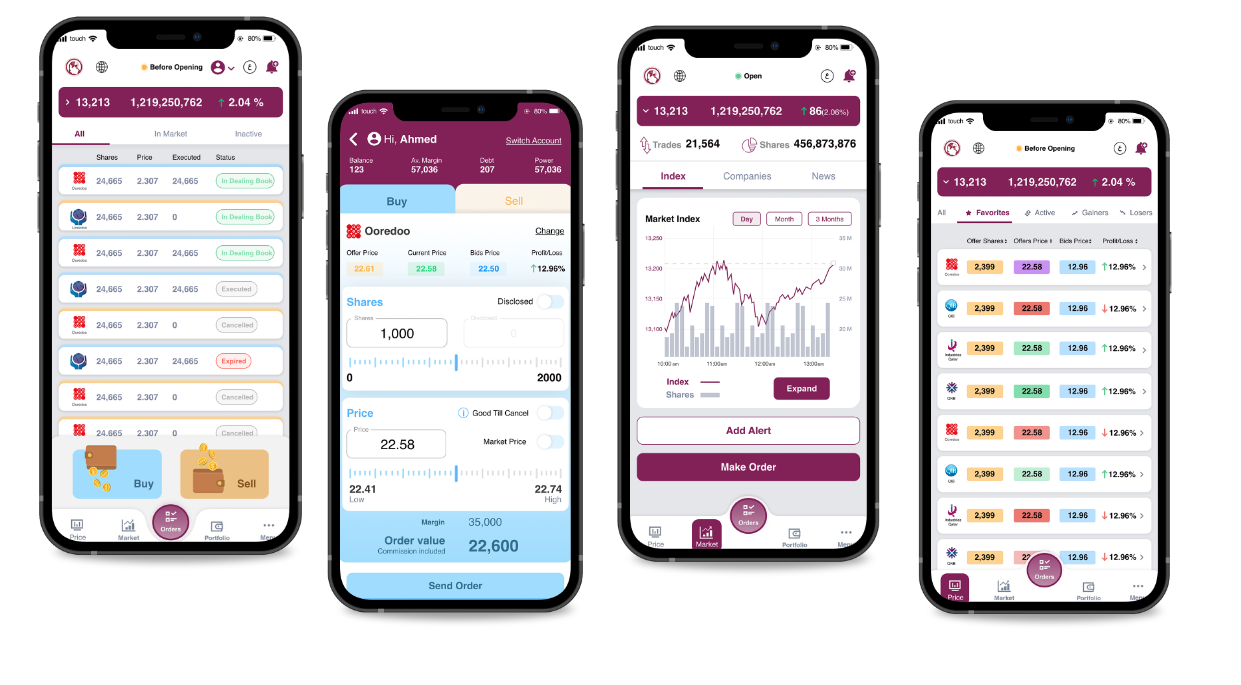
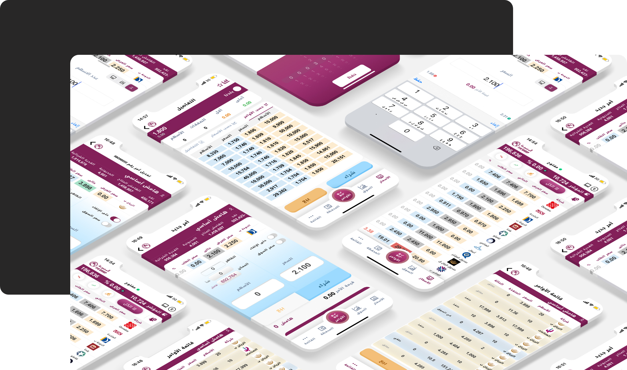
Design brought to Life
Final screens dynamism, and the latest trends while respecting local guidelines an the transformative vision aims to redefine user satisfaction and maximize ROI in Qatar’s market.
Takeaway
In our quest to achieve a user-friendly interface for an app with extensive information and intricate screens, we followed an approach based on three fundamental pillars:
Adhere to scientific guidelines, heuristics, and UX laws as guiding principles to meet industry standards and deliver an intuitive and seamless user experience.
Prioritize aligning with the user’s mental model, tailoring the interface to accommodate all personas and proficiency levels to foster inclusivity, allowing users of varying expertise to navigate the app effortlessly.
Integrate frequent testing sessions with representative users throughout the design process to refine and optimize the interface based on genuine user interactions, ensuring that our final product not only met but exceeded user expectations.
"Mindflares breathed life into our vision and exceeded all expectations!
They blend creativity and science to deliver a delightful experience on all levels. Unsurprisingly, we continue to collaborate with them on numerous projects."
Joseph Abou Jawdeh
IT and Web Manager at Al Joumhouria
"An excellent team to work with, extremely creative and professional. Through their deep understanding of our business and client needs, they have offered effective and high-quality UX design services. They offer the right level of support in every aspect of the project."
Carole Alsharabati
Founding Partner of Siren Analytics and Siren Associates
"Mindflares is one of those companies that makes magic happen for your products. It starts with a three-word request and ends up with a solidly grounded UX/UI design that conquers and charms the users. Their agility, commitment, and creativity are impressive. They are the kind of partner you need to ace your objectives and succeed in your business."
Wissam Youssef
Co-Founder and General Manager of CME Offshore
"Partnering with Mindflares has been an inspiring and fruitful journey and still is. Mindflares’ approach to business combines high ethics, transparency, and communication skills which were keys to our success."


 Issues
 Heuristics Violated
 UX laws Violated
 Issues
 Heuristics Violated
 UX laws Violated